

•RÉ • Domaine Culturel
Identité et territoire de marque
Brand identity and territory
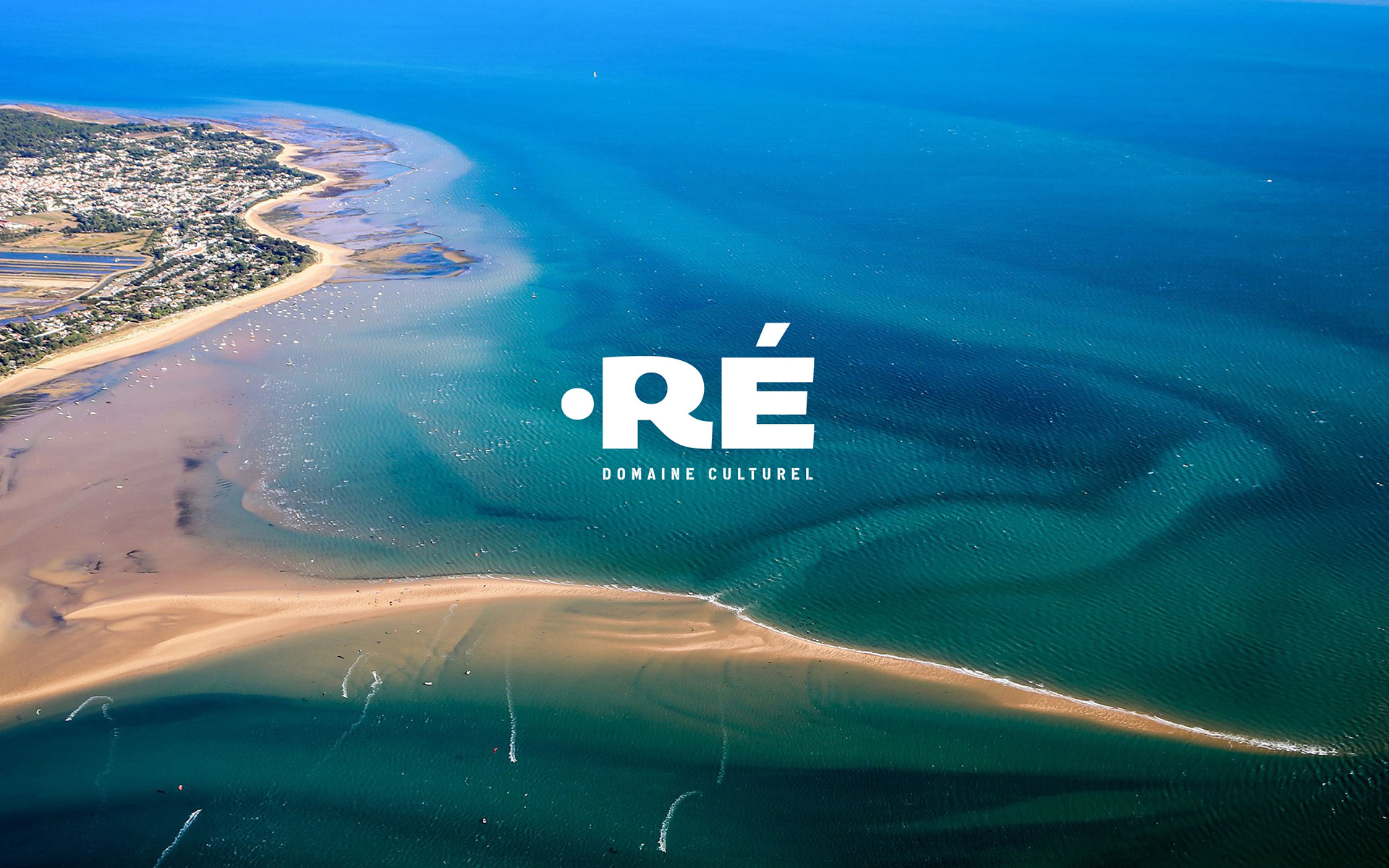
Historiquement l'offre culturelle de l'Île de Ré était centrée sur un lieu unique, La Maline, situé dans la commune de La Couarde-sur-Mer. En 2019, la communauté d’agglomérations de l’île de Ré reprend la gestion de la culture de l'île et de La Maline.
La communauté d’agglomérations a souhaité enrichir l'offre culturelle en la diffusant à l'ensemble des communes de l'île. Passant ainsi d'une salle de spectacle à tout un territoire.
Historically, the cultural offer of Ré island was centered on a single place, La Maline, located in the municipality of La Couarde-sur-Mer. In 2019, the community of urban areas of Île de Ré took over the management of La Maline and the island's culture.
The community of agglomerations wanted to enrich the cultural offer by spreading it to all the municipalities on the island. Thus going from a performance hall to an entire territory.
Avec l'agence Hugh by Sioux nous avons imaginé une identité qui mettait en avant à la fois l’ancrage territorial, le rayonnement de l’offre culturelle et l'extension d'un domaine géographique.
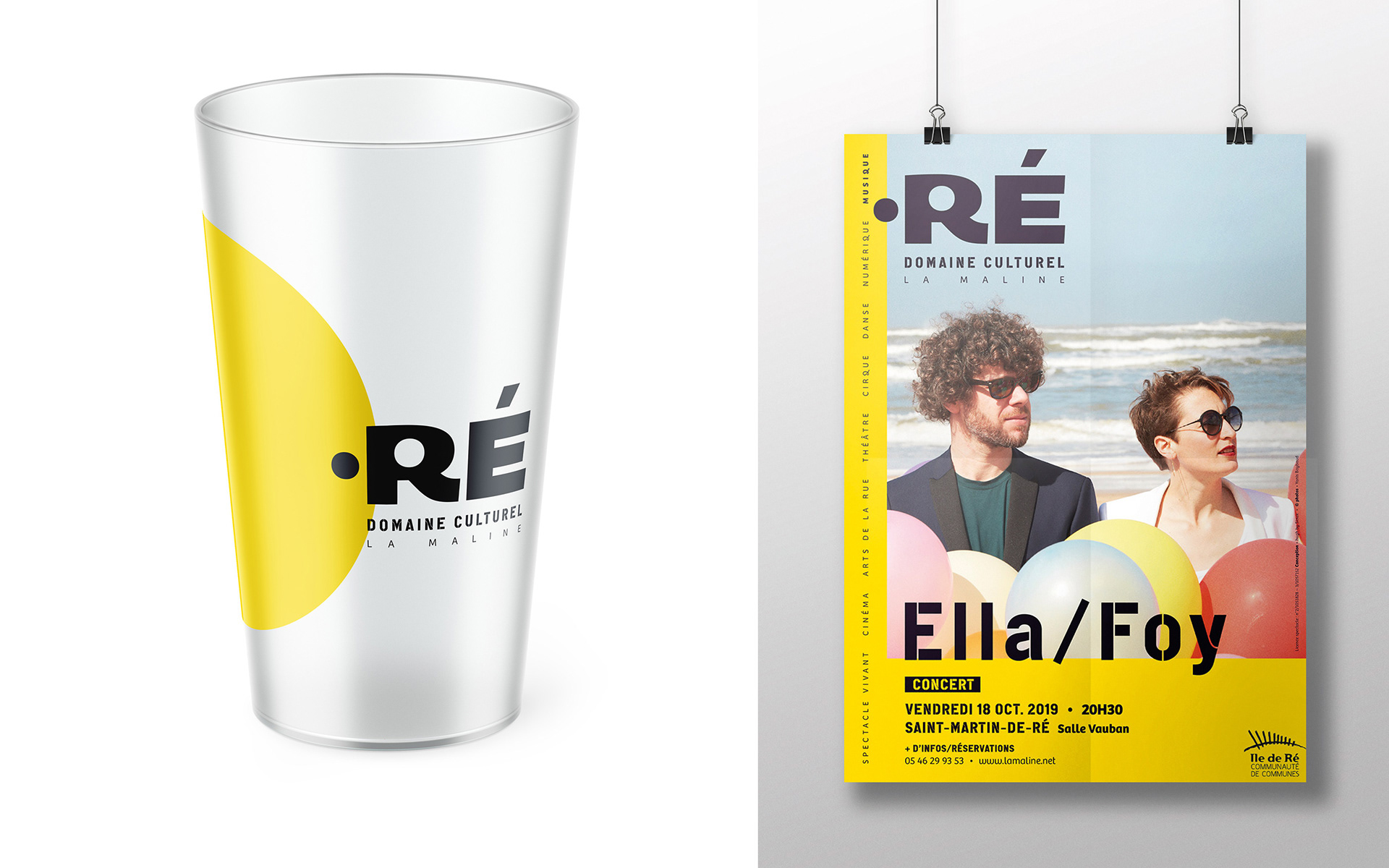
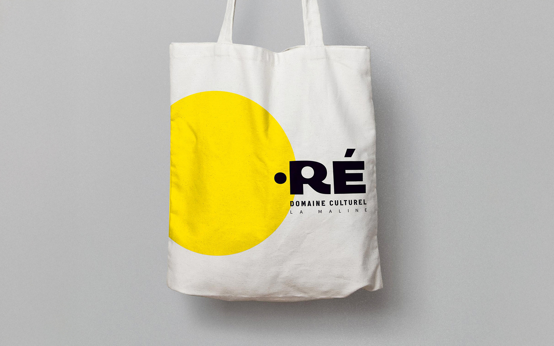
Pour cela, nous avons créé un nom image “•RÉ” qui établit l’offre culturelle tel un domaine. Ce domaine est un clin d’œil aux extensions de site internet (.com, .fr, etc.).
With Hugh by Sioux agency, we imagined an identity that highlighted the territorial roots, the diffusion of the cultural offering and the extension of a geographic area.
For this, we created an image name ‘•RÉ’ which establishes the cultural offer as a domain. This domain is a nod to website extensions (.com, .fr, etc.).
La vision et l'ambition de la scène culturelle rétaise s'affirme dans cette identité qui porte le nom du territoire en lettres capitales.
Le point, issu de la lettre “R”, introduit le nom et symbolise à la fois le point de départ, l'épicentre de la diffusion de l'offre culturelle, l'ancrage au territoire, la connexion qui rassemble et l'électron libre, vivant.
Le Domaine Culturel avec son ensemble de produits culturels a pour valeurs de rassembler les publics sur son territoire.
The vision and ambition of the cultural scene from Ré island is affirmed in this identity which bears the name of the territory in capital letters.
The point, coming from the letter ‘R’, introduces the name and symbolizes both the starting point, the epicenter of the diffusion of the cultural offer, the anchoring to the territory, the connection that brings people together and the free, living electron.
The Cultural Domain with its set of cultural products has the value of bringing together audiences on its territory.
Typographies
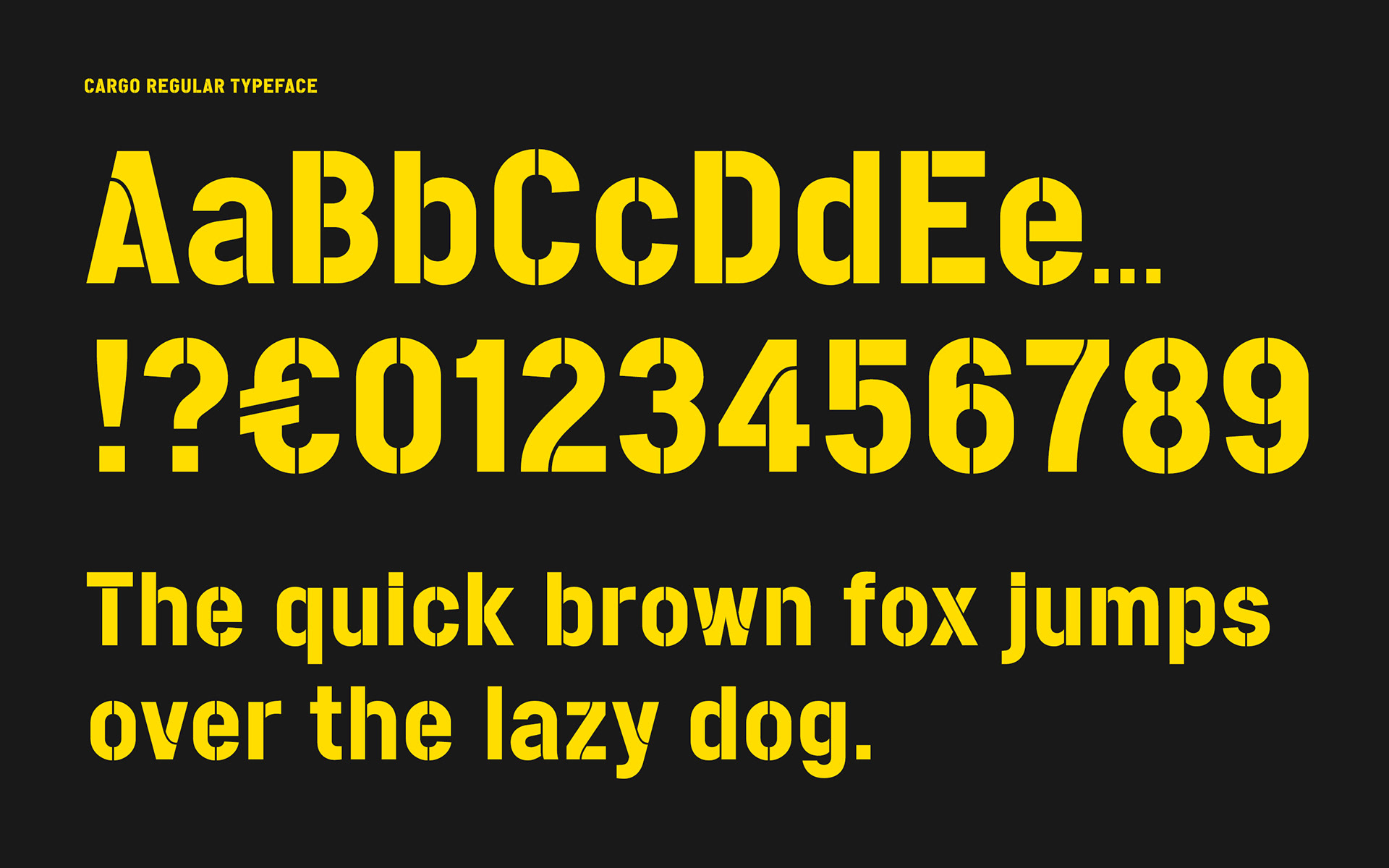
Deux typographies sont utilisées, la Cargo pour les titres et sous-titres. Elle fait partie de la famille des caractères stencil qui a une évocation marine en rappelant le marquage des bateaux. Son dessin stable, solide, géométrique a un impact visuel fort et un aspect brut. Elle est utilisée pour le descripteur “Domaine Culturel” du logotype.
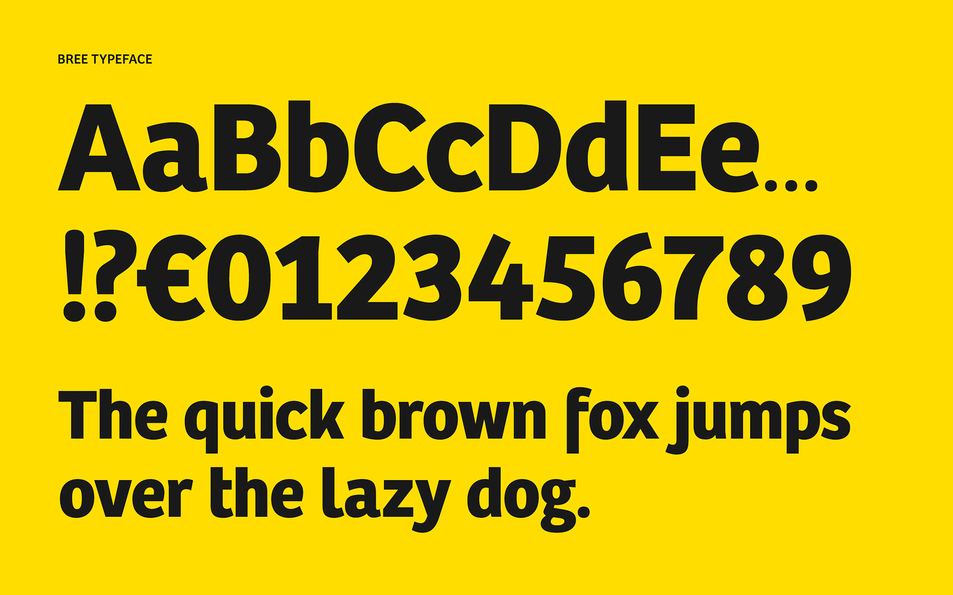
Les textes courants utilisent la Bree au dessin rond et doux. Certaines terminaisons rappellent l'écriture manuscrite, apportant un aspect humain. La légèreté de cette linéale contraste avec la Cargo.
Typographies
Two typographies are used, the Cargo for titles and subtitles. It is part of the family of stencil characters which has a marine evocation reminiscent of boat markings. Its stable, solid, geometric design has a strong visual impact and a raw appearance. It is used for the ‘Cultural Domain’ descriptor of the logo.
Common texts use the Bree with a round and soft design. Some endings are reminiscent of handwriting, bringing a human aspect. The lightness of this sans-serif typeface contrasts with the Cargo.
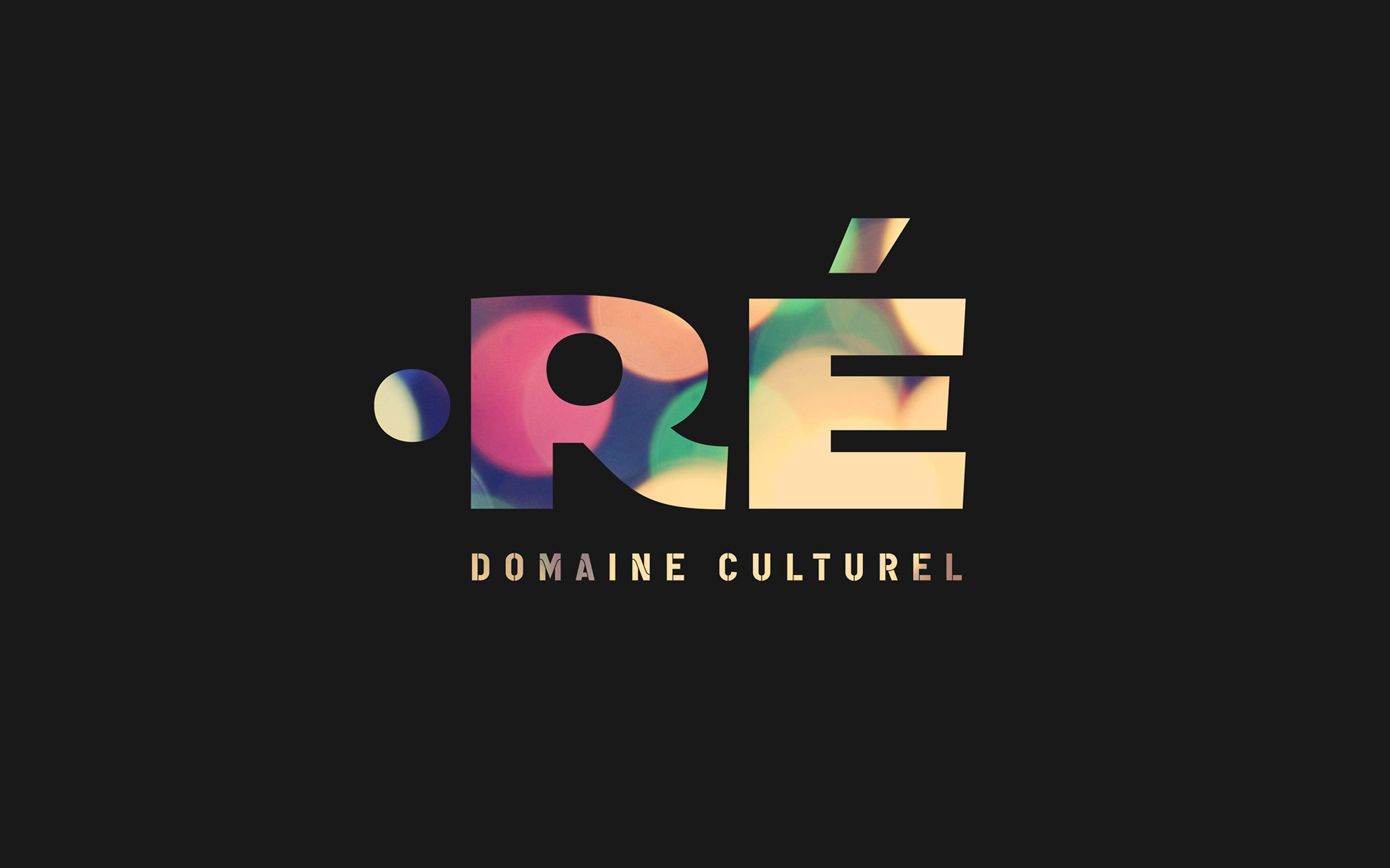
Couleurs
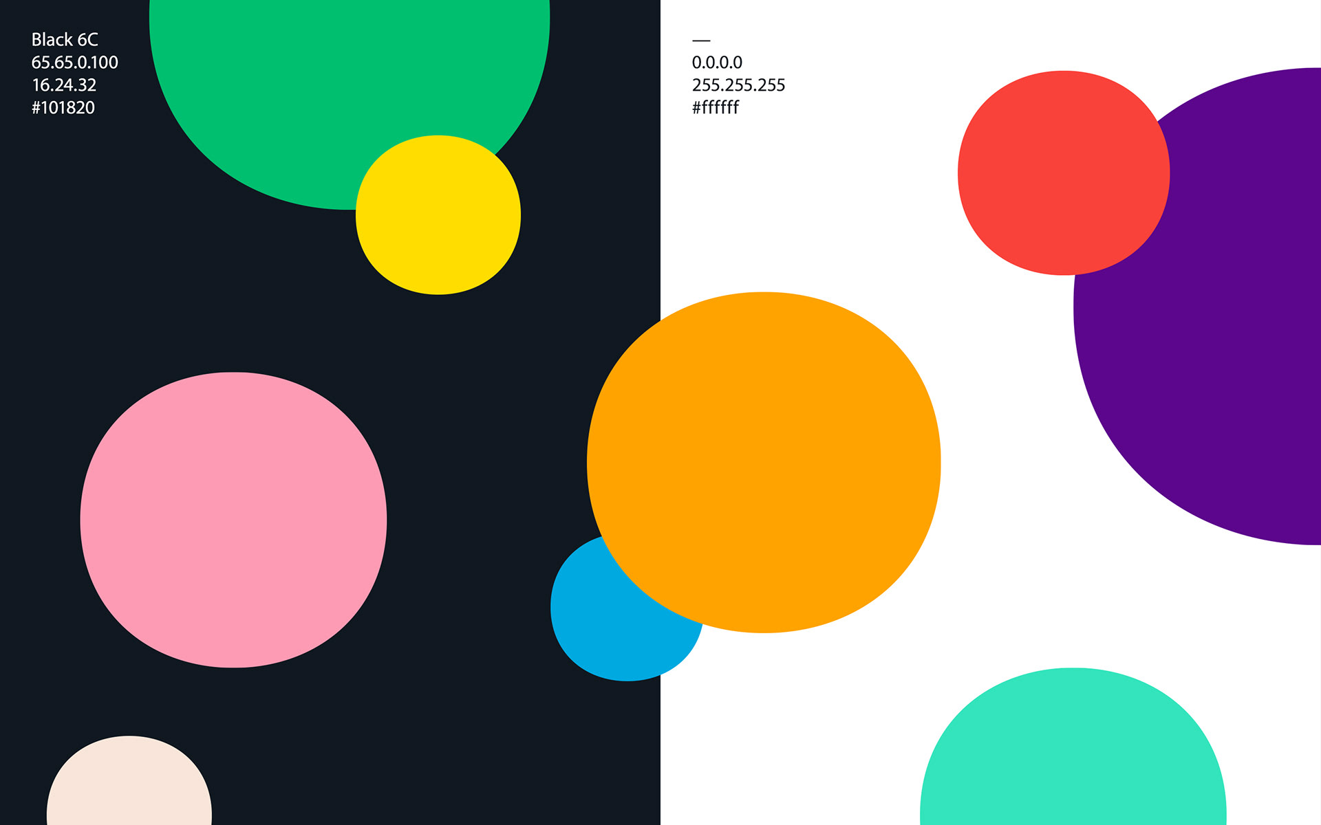
La gamme colorielle est riche, variée, constituée majoritairement de couleurs vives. Elle s'inspire des couleurs que l'on retrouve sur l'île que ce soit dans la faune, la flore, l'architecture, l'océan, etc.
Elle représente, la diversité des événements de •RÉ Domaine Culturel, la diversité des villages et des habitants de l’île qui sont au cœur du Domaine Culturel.
Pour chaque saison culturelle, un binôme de couleurs sera choisi afin d'identifier et marquer le changement.
Colors
The color range is rich, varied, mainly made up of bright colors. It is inspired by the colors found on the island, whether in the fauna, flora, architecture, ocean, etc.
It represents the diversity of •RÉ Domaine Culturel events, the diversity of the villages and inhabitants of the island who are at the heart of the Cultural Domain.
For each cultural season, a pair of colors will be chosen in order to identify and mark the change.
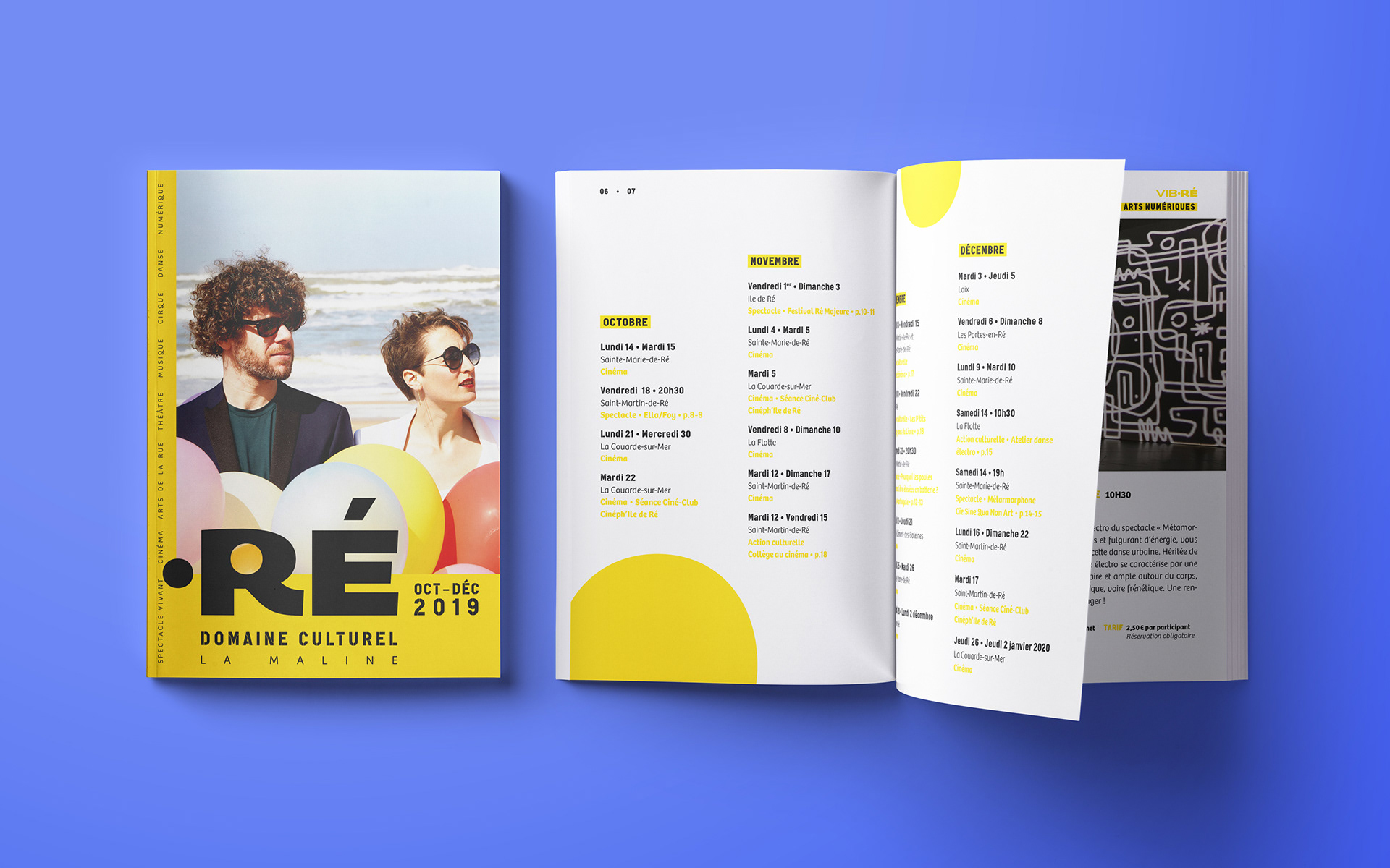
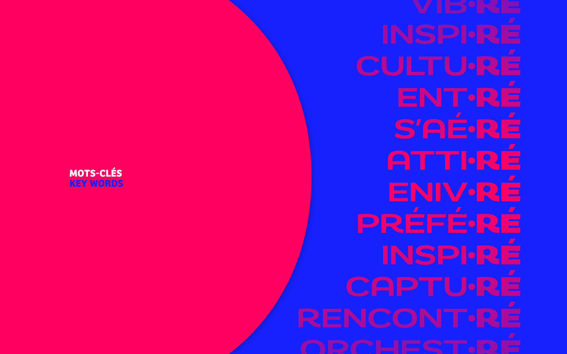
Pour enrichir le territoire graphique de •RÉ • Domaine Culturel, nous avons également joué avec son nom pour créer des mots en lien avec l’activité du programme culturel, ainsi que les émotions, les sensations qu'il peut susciter (CULTU•RÉ, VIB•RÉ, INSPI•RÉ, ORCHEST•RÉ, ENIV•RÉ, ATTI•RÉ…).
To enrich the graphic territory of •RÉ • Domaine Culturel, we also played with its name to create words linked to the activity of the cultural program, as well as the emotions and sensations it can arouse (CULTU•RÉ, VIB•RÉ, INSPI•RÉ, ORCHEST•RÉ, ENIV•RÉ, ATTI•RÉ…).

Agence . Agency — Hugh by Sioux
Direction artistique . Art direction — Mehdi Nachi